Warm color palettes have always played a powerful role in American interior design. From soft terracotta living rooms to caramel-toned kitchens and golden beige bedrooms, warm tones create spaces that feel welcoming, grounded, and lived-in.
Unlike cool palettes that lean toward crisp minimalism, warm colors add personality. They make rooms feel layered, comfortable, and emotionally inviting.
In this guide, we’ll explore how to use warm color palettes room by room — with real-life combinations that work beautifully in modern American homes.
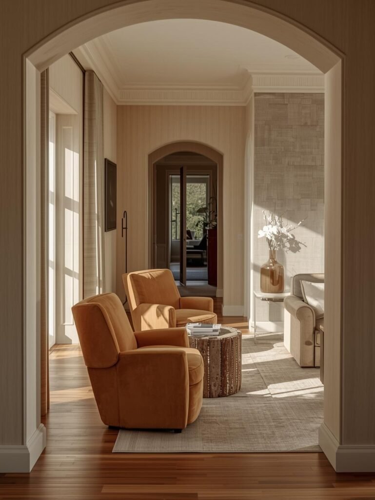
🛋 Warm Living Room Color Ideas
Warm living rooms feel intimate and welcoming. The key is balancing earthy tones with texture and natural light.
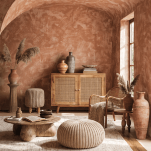
Terracotta & Cream Living Room
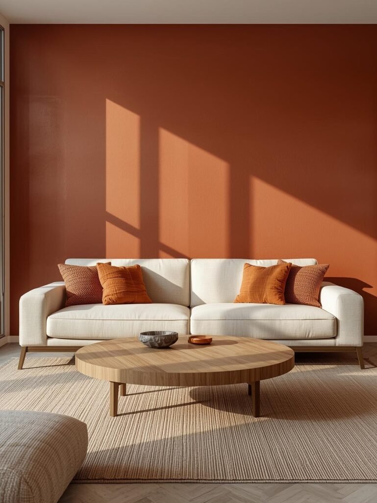
Caramel & Beige Living Space
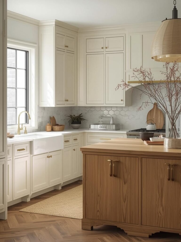
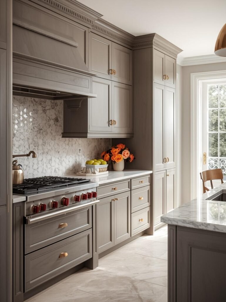
🍽 Warm Kitchen Color Schemes
Warm kitchens feel inviting and timeless when wood and soft tones are layered carefully.
Warm White & Wood Kitchen
Soft Taupe & Copper Kitchen
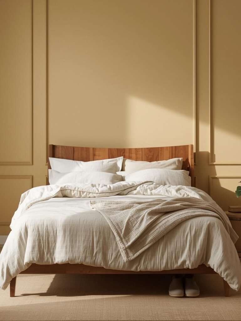
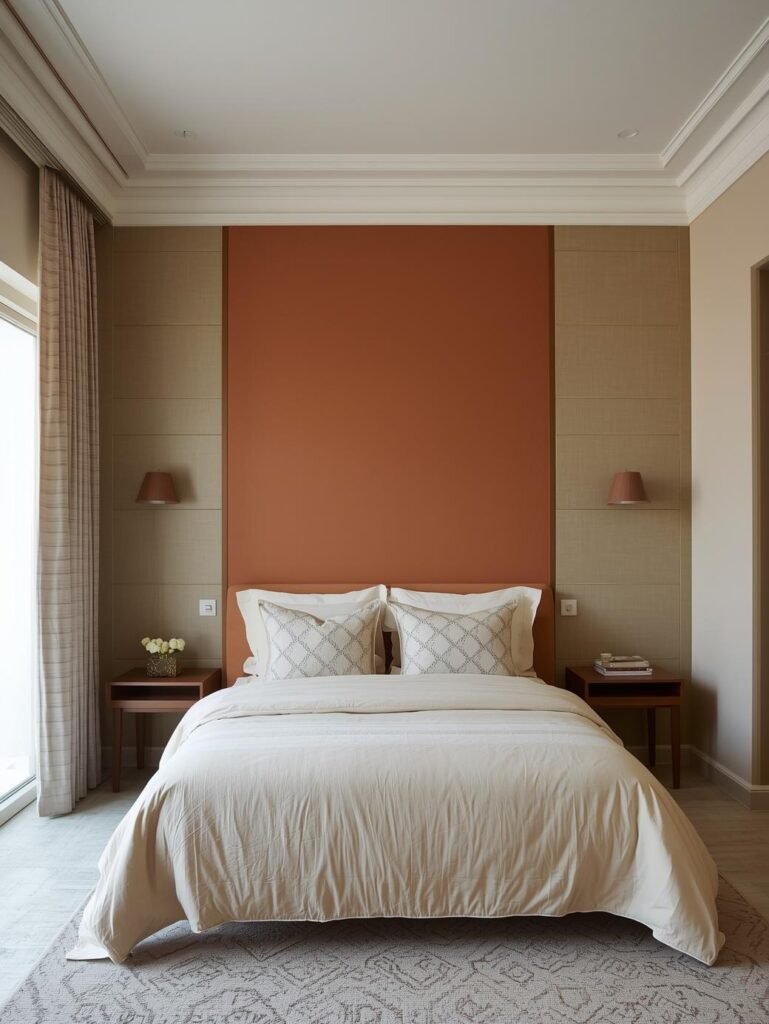
🛏 Warm Bedroom Color Harmony
Warm bedrooms create restful environments through layered earthy tones.
Golden Beige & Linen Bedroom
Clay & Cream Bedroom
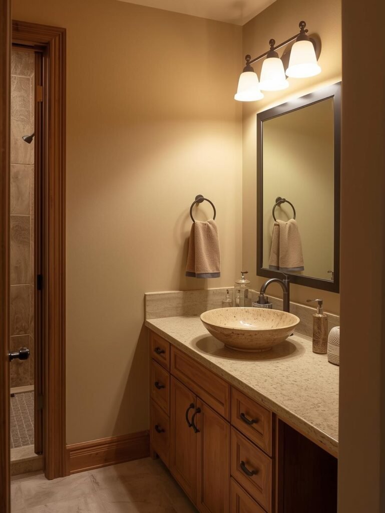
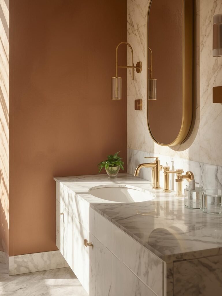
🛁 Warm Bathroom Color Ideas
Warm bathrooms feel spa-like yet inviting.
Sand & Wood Bathroom
Warm Marble & Brass Bathroom
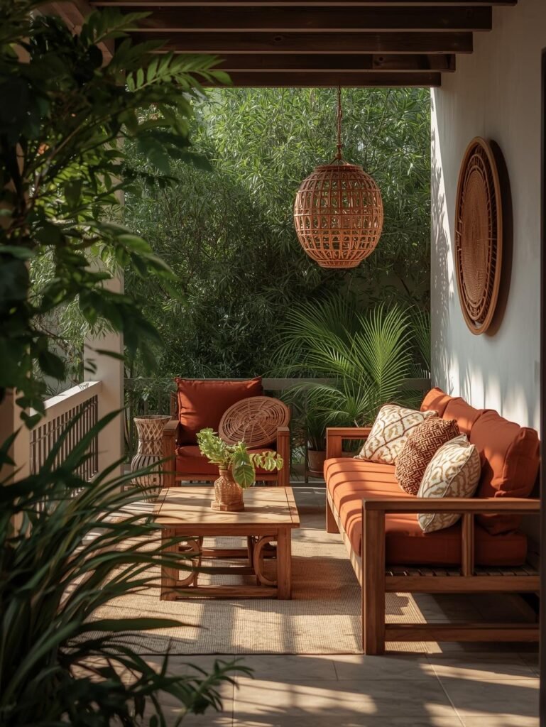
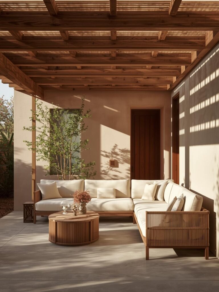
🌿 Warm Outdoor Patio Palette
Outdoor spaces benefit greatly from earthy warm tones.
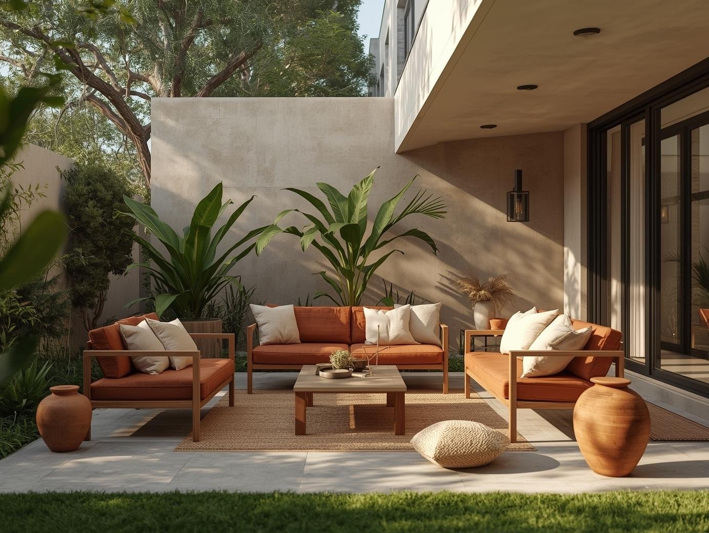
Terracotta & Wood Patio
Earthy Neutrals Patio Design
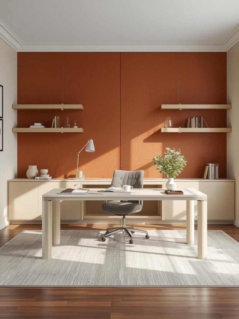
💻 Warm Home Office Palette
Beige & Walnut Office
Rust & Cream Workspace
Why Warm Color Palettes Work So Well
Warm color palettes:
- Make spaces feel welcoming
- Layer beautifully with natural materials
- Work across traditional and modern interiors
- Feel timeless rather than trendy
In American homes, warm palettes perform especially well in fall and winter seasons — but when balanced with light and texture, they feel relevant year-round.